Stuttgart City Library
Interior design and signage
Category: Interiors
Year: 2011
Location: Stuttgart, Germany
Photographs: Victor Brigola
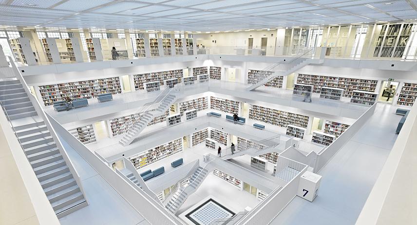
The new public library in Stuttgart, Germany is one of the biggest public libraries in the world and sets important standards in Stuttgart concerning cultural aspects and the availability of knowledge and education as a social element.
Totems has completed the entire interior of the house designed by the Korean architect Eun Yuong Yi. During a two-year process dealing with these concepts, the medial presentation was analyzed, examined and finally realized. The complex challenge and the aim was to create an atmosphere of living amidst different forms of media- thus realizing a special quality of atmosphere in each and every zone and level of this building. The aim was not to just gather and collect different forms of media, but to actually live amidst them.
The interior design resembles the plain, geometric and well-structured concept of the outer appearance. Just like the books and all other media, terminals for visitors are integrated into the shelves that dominate each room. The range of books and other media is manifold: all forms of print products, data media, digital files, sheets of music, games, pictures and various collections. Highlights are special pieces of furniture. There are rooms for private as well as group studying and even areas to communicate with each other.
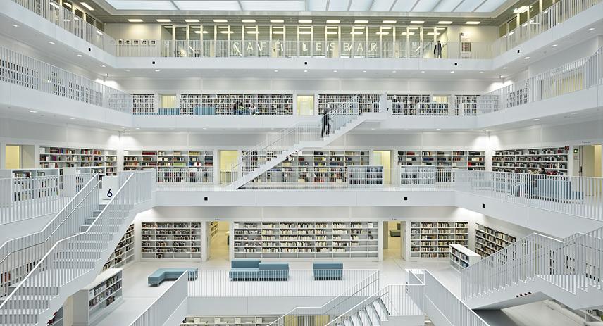
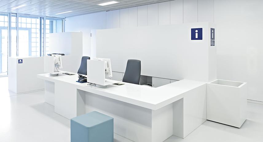
Already in the foyer you find elements of design that will reappear on all the other seven levels of that building. Examples are: the “Studiolo” as a room to actually reflect intensively on different concepts; service- facilities such as the information booth, self-service checkout devices, computer labs and a control system. Only in the basement you will find the “Skriptorium”- a modern reminiscence of the ancestor of today’s librarianship.
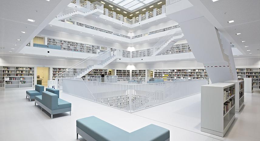
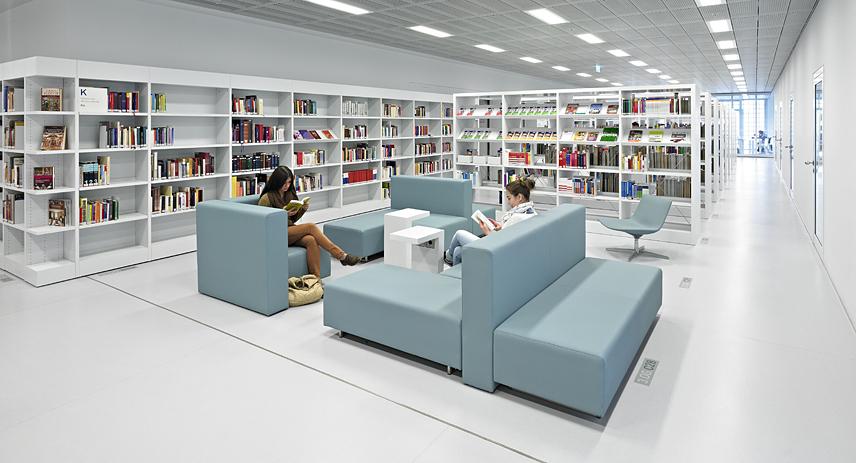
The special ambiance of the funnel-shaped reading room comes from shelves that are flush-mounted- thus creating a “monumental room of books”. The plain and simple furnishing adds to this effect. The shelving system was exclusively developed for this library. The system also includes facilities for the OPAC-search, for self-service checkout devices and to sit down and rest. In between the shelves you will find individual and group workstations as well as seating areas and the “Studioli”.
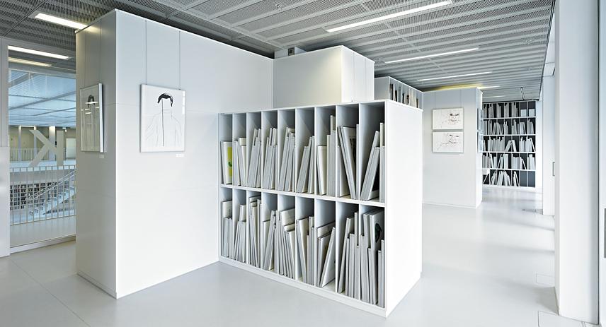
There are different media presentations on each level which function as showcases for visitors. A special focus was put on the furnishings of the levels of music, children and art. A “music staircase” invites you to listen to music and a sound studio gives you the opportunity to browse and compose. In order to easily change between temporary exhibitions, art is shown in a flexible room with special walls. The arrangement of the children’s library strengthens the creative influence.
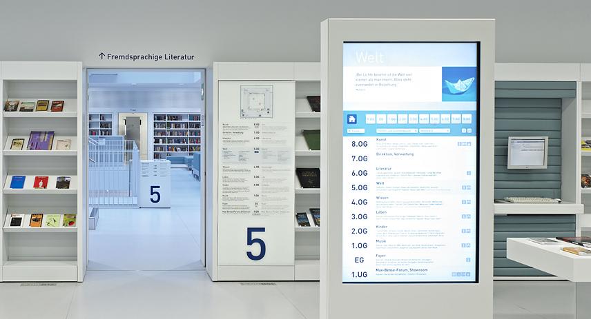
The base colour of all furnishing elements corresponds exactly to the light-grey tone of all the other architectural and technical surfaces of the building. Cushioned areas are held in the CI-colour blue. A lively green dominates the children’s level. Markers on the floor are coding spaces for shelves. Separators in the shelves give orientation and create special subject areas. Cubes make the orientation within the shelve much more easy. Digital information-steles are there for orientation and information. Visitors can find different kinds of media by following these steles. On top of that they also hint at the various activities and events of the library.
